martedì 8 settembre 2015

Aston Martin Stonehenge – Immagini del modello stampato in 3D


Questo post è dedicato alla prima galleria fotografica del prototipo, realizzato in scala 1:14.
Nel tempo, arriveranno nuove inquadrature, che permetteranno di osservare la mia Aston Martin da ogni punto di vista.
Intanto, nell'altro blog "Fabbrica In Scatola"  è possibile vedere, in tempo reale, la nascita della Stonehenge in scala 1:8!

Aston Martin Stonehenge – Photo gallery of the 3D printed model

Here is the first collection of pictures about the 1:14 scale model.
The gallery will be periodically upgraded with new snapshots, that will give you a full overview of my Aston Martin from every point of view.
Meanwhile, on my blog  "Fabbrica In Scatola"  you will see real-time updates about the birth of the 1:8th scale model!

Ritorna alla pagina iniziale / Back to Home Page

sabato 8 agosto 2015

Aston Martin Stonehenge – Una nuova filosofia di stile stampata in 3D


Iniziate ad osservare da vicino l’affascinante gruppo dei megaliti di Stonehenge: vedrete solo nuda e pesante roccia, perfettamente tagliata e levigata solo sulle superfici di contatto fra i vari elementi.
Ma se lo sguardo si allontana, anzi, spostandoci in alto, si vedrà la disposizione esattamente circolare dei macigni e quella sensazione di gravità diventerà quasi leggerezza, perché il cerchio sembrerà ruotare su se stesso, come se descrivesse un’orbita, sospeso nell’Universo.
Prendete ora una qualsiasi vettura Aston Martin e ripetete l’esperimento, partendo dal dettaglio per spostarvi a una visione d’insieme. Vedrete dapprima un oggetto essenziale e ben rifinito; ampliando il campo visivo, le sue linee appariranno come logica evoluzione dell’intero lavoro stilistico a cui appartiene. Le superfici della carrozzeria avvolgono il telaio con elegante continuità e composto dinamismo, lasciando intuire le impressionanti potenzialità che il motore può esprimere.
Diversi anni fa, mi posi una domanda: è possibile creare il design di un’Aston Martin che mostri, nel complesso, gli equilibri e i tratti tipici del Marchio, ma che risulti, nel dettaglio, formato da oggetti quasi indipendenti fra loro, addirittura pesanti, “ruvidi” e sgraziati? In altre parole, una sorta di “Stonehenge” su quattro ruote…
Ecco perché il progetto si chiama con il nome in codice “0215”: le prime due cifre indicano il 2002, anno in cui questa domanda nacque nella mia mente. Non voglio dire che siano trascorsi 13 anni di ricerca continua, ma il problema è sempre stato presente in me, ho tentato molte soluzioni e nessuna centrava l’obiettivo. Quest’anno, ero sul punto di rinunciare, poi è nato il prototipo che inizio a mostrarvi con le prime foto qui pubblicate. Dunque, non credo di essere arrivato a un punto di arrivo, ma la mia Aston Martin “Stonehenge” può rappresentare l’inizio di un inedito percorso di ricerca, applicabile anche alle filosofie stilistiche di altre Aziende. Il mio lavoro risponde non soltanto a requisiti puramente estetici, ma proprio le alte prestazioni dell’auto hanno incentivato un’attenzione particolare ai problemi dell’aerodinamica, sia sul fronte della stabilità nella guida veloce, sia nel miglioramento dell’efficienza energetica.
Insomma, la Stonehenge ha finalmente tradotto in realtà un concetto astratto che nel 2002 era puramente indefinito, ma ora si presta a ispirare future evoluzioni.
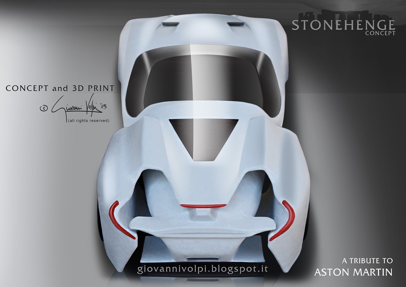
L’argomento è ricco di spunti di approfondimento e merita di essere visto dal vero, non soltanto attraverso i disegni, ed è per tali ragioni che ho deciso di creare un modello in scala con la mia stampante 3D.
La maggior parte della futura attività del mio blog sarà dedicata a svelare sempre più nel dettaglio le caratteristiche della mia Aston Martin; per ora, mi fermo qui senza fornire descrizioni, né spiegazioni tecniche.
Vi lascio le prime due foto “ufficiali” della Stonehenge perché iniziate a comprendere a fondo il concetto stilistico, immaginando quello che ancora non si vede.
Vi ringrazio per l’attenzione che vorrete dedicare.


Aston Martin Stonehenge – A new design philosophy printed in three dimensions

Let’s start watching the charming group of megaliths of Stonehenge: you will see only bare and heavy rock, with perfectly cut and smooth surfaces where the elements lean on each other.
But if you look from a longer distance, even from above in the sky, you will see how exactly circular is the layout of the rocks thus you will feel how that “heaviness” turns into “lightness”, because that circle will suggest a sort of rotation, like it’s floating in the Universe in orbital move.
Let’s now consider any Aston Martin model and repeat the experiment, starting from a close-up on a single detail then watching the whole bodywork. You will see first an essential and well finished object; the more your sight  gets wider, the more this detail will become as a logical evolution of the whole design work it belongs to.
The surfaces of the coachwork wrap the chassis with continuous elegance and soft dynamic energy, so you can just sense the powerful performance of the engine.
Some years ago, I put  a question to myself: is it possible to conceive an Aston Martin style that shows all the essential balance and distinguishing marks of the Brand, while resulting as a collection of elements with unconnected personalities, each one looking even “heavy”,  “raw” or “clunky”?
In other words, is it possible to design a kind of “Stonehenge” on four wheels?
That’s why I’ve chosen the code number “0215” for this new project: the first two figures mean the 2002 year, when this problem was born in my mind. I don’t mean I’ve spent 13 years in restless research, but the question has always been alive in me, so I tried to find several solutions, every time missing the final goal
This year I was going to quit, then I had the idea for the prototype that I’m going to share with you by starting from these pictures.
It doesn’t mean I’ve reached the final target, but  my Aston Martin “Stonehenge” might be the beginning of an unprecedented creative path, even suitable for the design philosophy of other Brands.
My job is not barely oriented towards aesthetic purposes, especially because the high performance of the vehicle has inspired a peculiar attention for aerodynamics, not just to enhance the handling at high speed, but also to improve the energy efficiency.
Finally, the Stonehenge embodies a theoretical concept that in 2002 was totally undefined and now it’s ready to inspire future evolutions.
 The matter is full of contents, so it deserves to be  watched not only through drawings, but in reality, that’s why I wanted to make a scale model with my 3D printer.
Most of the future activities of my blog will be dedicated to unveil deeper the features of my Aston Martin; but now I let the pictures talk, without additional descriptions nor technical explanations.
Now it’s up to you to understand the personality of Stonehenge  through the first two “official” photos and you will imagine what’s still hidden.
I am grateful to you for the attention you will spend.


Ritorna alla pagina iniziale / Back to Home Page

mercoledì 27 maggio 2015

Carro funebre “Death Metal”


Divertiamoci un po’ e immaginiamo un’auto funebre da prestazioni estreme, adatta all’impiego su pista.
L’idea di questo disegno nasce dalla mia esperienza professionale, che comprende anche il settore delle auto funebri.
Il veicolo di base risale ai primi studi compiuti attorno alla Mercedes-Benz Classe E W212.
La trasformazione ipotizza una revisione completa della carrozzeria, che risulta allargata in funzione di un autotelaio con carreggiate più ampie e pneumatici davvero “esagerati”; in più, essa risponde alla necessità di aprire condotti di entrata aria per motore, freni e tutti gli impianti di bordo, oltre allo smaltimento del calore dagli stessi dispositivi.
Oltre all’imponente ala di coda, troviamo una certa abbondanza di superfici aerodinamiche per generare carico e ottimizzare i flussi d’aria laddove insorgerebbero turbolenze o comunque effetti dannosi all’efficienza generale.
Come accade per ogni vettura, sulla porzione anteriore del tetto, viene compressa l’aria che scorre sopra il veicolo, creando un effetto di depressione che aumenta con la velocità a scapito dell’aderenza. Per ridurre tale problema, ho ipotizzato una soluzione per sfogare una parte dell’aria, deviandola attraverso “branchie” laterali.

Infine, il frontale ha ricevuto una radicale trasformazione per eliminare ogni riferimento allo stile della Casa Madre e improntare l’auto con la personalità più cattiva possibile. I gruppi ottici sono stati sostituiti con proiettori e strisce a led reperibili sul mercato, regolarmente omologati, che aiutano a ridurre le spese di allestimento del prototipo.

“Death Metal” hearse

Let’s have some fun and imagine how an extreme-performance hearse might be like, even suitable for track use. The idea about this drawing comes from my professional experience, that even features design consulting for hearse manufacturing.
The basic vehicle belongs to my early studies around Mercedes-Benz E-Class W212.
The tuning rebuilds completely the coachwork, that now is wider because of extended gauge along with huge tyres; moreover, it features several air intakes for engine, brakes and all the on-board devices, with also exhaust ducts for heat.
Besides the large rear wing, there are more aerodynamic surfaces to improve the downforce and optimize the air flow where turbulences arise together with side effects to general efficiency.
As it happens to every vehicle, the front section of the roof compresses the flow and lowers the air pressure the more speed gets higher. This consequence affects the grip on the track. To reduce this problem, I have conceived a way to exhaust some of the air, that is directed through side “gills”.
Finally, the front has been fully transformed to delete every style mark of the Original Manufacturer and give the car the “angriest” personality. The lights have been replaced with lamps and led spots, all approved and available on the market, that help reducing the expense of prototype manufacturing.

Ritorna alla pagina iniziale / Back to Home Page

sabato 9 maggio 2015

Artwork: MASERATI MISTRAL


Il mio piccolo contributo alle celebrazioni per i primi cento anni di storia Maserati: una illustrazione eseguita a Photoshop, dedicata al modello Mistral.
È un'auto di fondamentale importanza nel passato della Fabbrica, perché fu la prima ad essere battezzata col nome di un vento, inaugurando una tradizione che prosegue ancora ai giorni nostri.
Disegnata attorno ad un abitacolo a due posti, la carrozzeria è una sintesi delle tendenze stilistiche tipiche degli anni '60, ma la firma del celebre torinese Pietro Frua si nota nella definizione di un ricercato equilibrio di forme che, accostato all'originalità delle finiture cromate, conferisce alla Mistral una personalità inconfondibile rispetto al panorama contemporaneo.
Il fascino che emana quest'auto è nella combinazione fra un'estetica di superlativa eleganza e una meccanica vincente nelle competizioni, perché il motore (a 6 cilindri in linea) fu derivato da quello della 250F, campione del Mondo di Formula 1 nel 1957 con Juan Manuel Fangio.
Il mio disegno si basa sui colori giallo e blu, che compongono la bandiera di Modena. Nonostante l'accostamento col blu, il giallo ha, per la cultura cittadina, una certa importanza. È risaputo, infatti, che il giallo cittadino fu scelto da Enzo Ferrari come sfondo del Cavallino Rampante; per i clienti Ferrari, il "giallo Modena" è sempre stato uno dei colori disponibili a listino. Come altro esempio, i giocatori della locale squadra di calcio vengono chiamati "Canarini".
L'edificio che si intravede sullo sfondo è la Cattedrale cittadina. Recentemente restaurata, ha ricevuto nuovi lavori di ripristino in seguito al terremoto del 2012. Nata come edificio dell'epoca romanica, ha subito evoluzioni e modifiche attraverso i secoli, fino ai tratti inconfondibili dell'epoca gotica, fra cui lo spettacolare rosone della facciata e la guglia della torre campanaria, il cui stile architettonico ha ispirato ai modenesi il soprannome di Ghirlandina.

My little contribution to the celebrations for the first one hundred years of history of Maserati Factory: an illustration about Mistral model, made through Photoshop.
This car is essential in the past of the Brand, because it was the first one to be named as a wind, becoming the starting point of a tradition that still lasts at the present time.
It was designed around a two-seater layout, with a bodywork that recalls the style trends of the 60s, but the signature of  famous Tourin designer Pietro Frua is highlighted by the careful balance of shapes along with the original look of chrome details, that give the Mistral a unique personality among the contemporary car production.
The charm of this model is due to the combination between the extreme harmony of the body and the performance of the 6-cylinder engine, that was developed from the project of the 250F, driven by Juan Manuel Fangio to achieve the 1957 Formula 1 title.
My drawing is made around yellow and blue colours, that recall the flag of Modena.
Yellow represents an important theme in the local culture. For instance, Enzo Ferrari wanted the Prancing Horse to be depicted on yellow background; for Ferrari Customers, "Modena yellow" has always been available in the basic range of coatings. Furthermore, the players of the local soccer team are known as "Canaries".
The building behind the car is the Cathedral of Modena. After the recent full restoration, new works have been done after the 2012 earthquake. Born as a church of Romanesque period, it has been transformed through the centuries, until the final influences of Gothic age, the two most important ones are: the magnificent rose window on the front and the spire of the bell tower, the style of which has inspired the citizens with the nickname "Ghirlandina" (little garland).

Ritorna alla pagina iniziale / Back to Home Page

giovedì 5 febbraio 2015

Alfa Romeo Trigonon: un nuovo design per Montreal e Alfetta


Vi presento il risultato dei miei studi relativi a una nuova personalità estetica per Alfa Romeo, concentrandomi su una proposta di berlina a 4 porte e relativa versione familiare.
Il medesimo principio stilistico è stato, infine, applicato ad una coupé a motore anteriore.
L'ispirazione è nata da Alfetta e Montreal, due modelli degli anni '70, divenuti icone rappresentative per il Marchio.
Ho reinterpretato queste auto ricercando un'identità moderna e dettagli inediti, senza rinunciare alla citazione di alcuni particolari di finitura tipici di allora.
L'obiettivo finale è quello di tracciare le basi per un'immagine con buone possibilità di evoluzione futura verso le prossime generazioni di Alfa Romeo.
Tutti i disegni riportano un marchio, chiamato TRIGONON, perché è quello il nome scelto per la filosofia stilistica, basata sul semplice elemento geometrico del triangolo. Attraverso le linee delle auto, è possibile individuare come tale figura diventi uno strumento per creare un'impressione dinamica che si traduce in forza, velocità, leggerezza, energica aderenza sull'asfalto.
Il triangolo di partenza, da cui prende vita tutto lo stile, è nel frontale: immaginando l'applicazione della tecnologia a led, ho definito i gruppi ottici con linee rette ed essenziali, in modo che restassero solo i due proiettori principali e il marchio Alfa Romeo come unici elementi geometrici circolari. Essi diventano i "poli" di riferimento per un triangolo immaginario, attorno al quale si orientano i tratti del design, che originano poi l'intera immagine della vettura.

Alfa Romeo Trigonon: a new design for Montreal and Alfetta

Let me introduce you to the result of my research for a new design personality about Alfa Romeo, with special focus on a four-door sedan and its station wagon version.
The same style philosophy has been used also for a front-engine sports car.
I got inspired by Alfetta and Montreal, that really became icons for the Brand during the 70's.
The design of these cars has been translated into a modern looking with innovative details, but also some peculiar finishing elements have been "quoted" and renewed.
The final aim is to establish the basics for a design with good chances of evolution towards future Alfa Romeo generations.
All the drawings feature the same TRIGONON emblem, that's the name I choosed for the design rules I imagined for this work.
It means that all the style is conceived around the essential geometry of triangle. Through the lines of the cars, it becomes clear how this shape works as an instrument that suggests dynamic impressions through different meanings: power, speed, lightness, grip on the ground.
The triangle that kick-starts the whole design is in the front: using the led technology, I've created the front light clusters with simple straight lines, thus we have the two main headlamps and the Alfa Romeo logo as the only round geometrical elements.
They become the reference "poles" to describe an imaginary triangle, around which the style begins than develops across the whole bodywork.

Ritorna alla pagina iniziale / Back to Home Page